Form Builder
Introduction
The Custom Form Builder creates forms within Resolve Actions Pro:
- Forms allow end users to enter data that is passed to a Runbook. There are many methods available to achieve this result.
- Forms are used to start Runbook execution and table creation.
There are two categories of forms.
- Forms can be used to "drive" automation as part of the user interaction in a process by asking users to fill out the customized forms in wiki document pages. The completed or selected forms can trigger Runbook execution or system scripts. As a result, Runbooks can control processes consisting of complex and concurrent events. These processes are driven by interactive human as well as systematic sources.
- Forms are also used for data entry and updating for custom tables in the Actions Pro database. Forms are used to trigger or resume Runbooks (from an event) that process user-entered data. This feature is very useful when the process requires repetition or large amounts of data entry.
A custom form can either be a:
- Standalone Form (with no table defined with it and all input type fields).
- Table-based form (with a Custom Table defined with the form and DB type fields)
Form Features
Forms are displayed on a wiki document page for task execution, such as executing a Runbook, system script, or event.
You can create a form in Actions Pro for data collection, starting with this template and add content controls. Some content controls include features such as:
- Check boxes
- Text boxes
- Date pickers
- Drop-down lists
The three panes that comprise Form Builder are:
- Field View – This displays all the added field in the form.
- Available Fields - These fields are designed for user to choose for drag and drop to submit data into the table shown in the field view.
- Form and Field Settings tabs - By default, the Form Settings tab is shown when a custom form is first seen. If a form field is ever clicked and highlighted in the Field View (live) on the left, then the right panel will automatically switch to the Field Settings tab.
These features are described in detail in individual sections in this document. The following commands are common to each form.
| Name | Function |
|---|---|
| Eject (Back) | Returns to previous page (Form Views) and cancels current operation with warning message. |
| Save | Saves all current input. This function is active after a name is entered in Form Settings > Name. |
| Save As | A method to copy an existing form. Only active when a form is open. |
| Preview | Use the preview mode to review your form as it will appear in Custom Form Viewer. |
| Refresh | Updates the page and has a warning message. It is used to cancel modifications and start fresh from an existing save. |
Form Procedures
This section covers these topics:
- Editing Existing Form
- Coping an Existing Form
- Deleting an Existing Form
- Creating a New Form
Accessing an Existing Form
To access the Form Builder:
From the main menu locate Table Administration and select View Forms.
Select a Form.
The View and Delete commands are now active.Name Function Create Open a new display to make a new form. View Displays the ready to use form. Delete Deleting an Existing Form. The custom form delete does not delete the linked custom table. Edit After selecting the icon the form will load and the screen will change to the Form Builder display. System Information Toggle this icon will add/remove system information about the file form. A box will appear around the icon to indicate a full display. Refresh Updates to reflect the current available form and information. The refresh intervals can be adjusted. Previous/Next Scroll back or forward to previous/next page of posts Advanced Search Opens the search/filter area to quickly search the existing form for specific contents. Advanced Search searches for a form name or a table name associated with the form. (Double Click Search performs the same function). Cancel Closes Advanced Search popup window. Select All Highlights and select all the forms shown for multi-delete.
Copying an Existing Form
To copy a custom form:
- To access the Form Builder, locate the Table Administration on the main menu.
- Select View Forms.
- Click the View Details icon in front of the from name.
- Select the Save As command.
A popup appears. - Enter a new Name or use a default name (auto-populated).
You can use letters, numbers, or underscores. - Enter the Title (this is unrestricted).
- Click Save As.
- Search for the copied form using and advanced search option ( ), sorting options or double click sorting.
The newly created form will appear.
Deleting an Existing Form
To delete a form:
- To access the Form Builder locate Table Administration on the main menu.
- Select View Forms.
- Select the form and press the Delete button from the menu list.
The custom form delete does delete the linked custom table. - Verify by selecting Delete.
Creating a New Form
To access the Custom Form Builder:
- Locate the Table Administration > Form Views.
A list of available forms displays. - Click Create in the control menu.
A new and untitled form displays in a new browser window. - Select any of the Available Fields to add features to the form. The list includes all the types of form fields available for a custom form.
See the Available Fields section for complete details. - Use Form Settings to name the form and table and add details to the form (applicable to the entire form).
See Form Settings section for complete details.noteThe field or form name cannot contain blank spaces or any special characters other than underscore (
_). - Use the Field Settings section to customize the selected field.
See Form Settings section for complete details. - Save the form by selecting the Save from the toolbar.
The Preview of Changes screen appears after selecting Save and displays any changes.
The Preview button displays the form in Form Viewer mode.
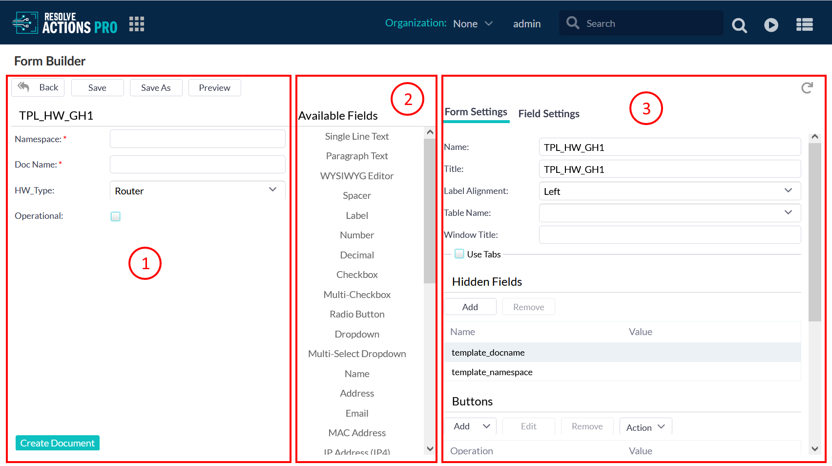
Form Builder
This is a preview of the form. As Available Fields are added the display will update showing a live version.
- Each option displays in the field (1) after it is dragged and dropped from Available Fields (2).
- For example, if you select the Address field and input "Your Address" in the Name option, "Your Address" gets displayed in (1).
- If you select the added field in the viewing pane (1), then the right panel (3) automatically switches to the Field Settings tab to provide configuration options for that selected field.
The Preview button allows you to see and correct the form.
Available Fields
The Available Fields list in the center column of the page. The list includes all the types of form fields available for a custom form.
- When a form field in the list is selected, it is automatically added to the custom form, as seen in the Field View pane.
- You can toggle any time between the Form Settings and Field Settings tabs on the right.
- When you select a field the field displays on the right-hand side of the window.
- Each option displays in the field on the left after it is completed.
The input fields are designed for user input. As each setting is completed, the configured field option appears on the left (if applicable, such as the name).
This table will show both the Available Field Settings above and the associated Field View just below. The standard field setting options are:
| Name | Function |
|---|---|
| Single Line Text | This field contains the standard field settings with Input and DB choices. The text box range can be changed as required, and defaults to 333 characters maximum. The Size option checkbox displays default width 300 and height 25. If you choose the DB type, then the Column Size option is added. |
| Paragraph Text | This field contains the standard field settings with Input and DB choices. The text box range can be changed as required, and default to 999999999 characters. The optional Size option, when checked, displays default width 300 and height 25. If you choose the DB type, then the Column Size option gets added. |
| WSIWIG Editor | Enables text HTML editing. This field contains the standard field settings with Input and DB choices. The text box range can be changed as required, and default to 999999999 characters. The optional Size option, when checked, displays default width 300 and height 25. If you choose the DB type, then the Column Size option gets added. |
| Spacer (DB Only) | The Spacer field enables you to insert space in your form between other fields. You can specify the size of the space and the dependencies. |
| Label | Adds static text to your form. |
| Number | The Number field allows for integer data entry. It adds a Range setting option to the Single-Line Text field. The Range options limit the acceptable values entered into the field, with a Minimum Value default of zero (0) and a Maximum Value default of 999,999,999. |
| Decimal | The Decimal field allows for fractional numbers data entry. The field adds a Range setting option to the Single-Line Text field. The Range options limit the acceptable values entered into the field, with a Minimum Value default of zero (0) and a Maximum Value default of 999,999,999. The decimal is limited to 5 decimal places after the point. |
| Checkbox | The Checkbox field provides a menu of check boxes to the user to select one of several answers. The field has the same Input and DB options as the Single-Line Text field, with the notable exception that the Default Value option is a checkbox (to set a default checked or unchecked status). |
| Multi-Checkbox | The Multi-Checkbox field is similar to the Checkbox field, except the user can select multiple boxes. The field has all of the same input and DB setting options as the Single-Line Text field, except there is no Default Value option. The Multi-Checkbox field adds Columns (default zero) to display the checkboxes. With several checkbox options, providing more room helps differentiate the separate checkboxes. The characteristic setting for Multi-Checkbox is, naturally, the Options for Checkboxes 1, 2, and 3, which allow adding, removing, and labelling checkboxes. Click on the "Import Pre-defined Options" button to use pre-set checkboxes, for example, gender, time zones, continents, etc. |
| Radio Button | The Radio Button and List fields are identical to the Multi-Checkbox field, with the Size and Dependencies options identical to the Single-Line Text field. |
| Dropdown | The Dropdown field is similar to the Checkbox field in providing a list of answers for the user to select. The field contains the same standard Input and DB settings options as the Single-Line Text field. The "Allow User Input" checkbox enables a user to enter a different option than those listed in the drop-down. The drop-down lists Options 1, 2, and 3 and configured similarly to checkboxes found in the Multi-Checkbox Field, including importing the same pre-defined options. |
| Multi-Select Dropdown | The Multi-Select Dropdown Field contains identical options to the Dropdown Field, except the user can select multiple answers. |
| Name | Both the Name and Address fields are identical to the Single-Line Text field, with a few exceptions. The Name field has no default value. The "Name Options" checkboxes toggle the display of separate fields for First, Middle, Middle Initial, and Last names. If desired, the Name field effect can be reproduced with multiple Single-Line text fields instead. note These fields control whether that specific box is displayed when collecting the data. If you do not require the middle initial or name, you can uncheck it and display just the first and last names. You can also create the same result by having two Single-Line text fields. note If you know that all users are in a specific country or state, use this option. |
| Address | The Address field is a pre-written set of text box fields for the user to input street address (two boxes for two address lines), as well as zip and country codes. The Address field, in addition to the standard Single-Line Text settings, includes Country and State options. If you know that all users are in a specific country or state, use these options. |
| This field contains the standard field settings with Input and DB choices. The text box range can be changed as required, and defaults to 333 characters maximum. The Size option checkbox displays default width 300 and height 25. If you choose the DB type, then the Column Size option is added. | |
| MAC Address | Allows entering a MAC address. This field contains the standard field settings with Input and DB choices. |
| IP Address (IP4) | Allows entering an IPv4 address. This field contains the standard field settings with Input and DB choices. |
| CIDR Address | Allows entering an IPv4 address with network mark using CIDR notation. This field contains the standard field settings with Input and DB choices. |
| Phone | The Phone Field options for Input and DB are identical. The Phone Field settings are identical to those of the Single-Line Text field, except there are no range or default values. The form field itself displays dash separators and a parenthesis prompt for area code. |
| Date | These fields have very similar Input and DB options and each is identical to the Single-Line Text field in most ways. For the Date field, the exception is the Default Value is a text box with a Calendar button. The button displays a month-by-month calendar with clickable dates. To manually enter the date, use the format mm/dd/yyyy, with leading zeroes for single-digit months or days. If the field is blank, the default is "today". |
| Time | The Default Value is a pull-down list of common times throughout the day. Click on the one required. If the field is blank, the default is "now". |
| Date Time | A combination of both date and time fields. There are no default values. You select the date by using the Calendar button and the time from the pull-down list. If the field is blank, the default is "now." |
| Link | The Link field is used to enter a URL link. The form field contains the same standard Input and DB setting options as the Single-Line Text field with certain exceptions. The Default Value is a text box to enter an URL. The Target option defaults to _blank, with _self, _parent, and _top as available options. You can provide your own target by typing the URL in that field. See http://www.w3schools.com/tags/att_a_target.asp for more information. The Range has default minimum zero and maximum 999,999,999 characters. The DB type of the Link field adds a Column Size parameter, which defaults to 1000. Other options are: 40, 333, 4000, and 4000+. |
| Password | The Password Input and DB options are identical to the Single-Line Text field, except for the Range value controlling the password length. The default maximum for Range 100 characters. The Password field is also automatically encrypted. The DB type parameter of Column Size defaults to 333, with available options 40, 1000, 4000, and 4000+. |
| Journal (DB Only) | The Journal field has identical Size and Dependencies fields to the Single-Line Text field. It also has the following DB setting options: Field Name (must be a database field)Field Labelable Alignment Read Only (checkbox)Hidden (checkbox) |
| List | The List field is similar to the Dropdown field in providing a list of answers for the user to select. The field contains the same standard Input and DB settings options as the Single-Line Text field. The "Allow User Input" in a list. The lists Options 1, 2, and 3 and configured similarly to checkboxes found in the Multi-Checkbox Field, including importing the same pre-defined options. |
| Sequence (DB Only) | The Sequence field is identical to the Single-Line Text field, with one exception: Prefix text box in which you can enter any sequence of numbers. The Sequence gets generated when the user loads a record. The prefix text gets used and a number is appended which is unique in the system. It is useful for ticketing a prefix for one type of record (for example, RBA for a bug fix). |
| Reference (DB Only) | The Reference field has many of the standard settings, including:Field Name Field Labelable Alignment Checkboxes for Read Only Hidden optionSize (Width defaults to 300 and height to 22)The distinguishing settings of a Reference field are options to refer to specific database records:Table (pull-down list of available tables)Column (pull-down list of available columns or enter a new name)Jump target URL (text box for an URL of a specific referenced record) |
| File Manager | The File Manager field does not contain a type option; it is solely for managing files in custom tables. A File Manager field appears as an Attachments list in the associated custom form. You can upload, download, and remove file attachments and specify the allowable file types in the list box. The files are located in a <table name>_fu (for file upload) separate from the custom table in the database.For example, a custom table named "example_one" with a File Manager field in its form would have an "example_one" table that stores all the data entered through its custom form, and an example_one_fu table that stores all file attachments. If the black.cat table is imported, exported, or deleted, then the example_one_fu table is also affected similarly. The user can use Database to view the file upload table. |
| Reference Table (DB only) | The Reference Table field settings do not display an Input or DB option. You can add or remove Reference Tabs, and specify a title in the text box. You can also enable the following options:Checkboxes:Allow a new reference table (enables adding, deleting, or viewing a reference record in the table)Delete a reference tableView a reference table Display in popup (specify a title, width and height default to 600). If you have selected the view option and have not specified this option, the record gets displayed in a new browser window.Select a table from the pull-down list Display columns selected from a pull-down list (you can multi-select the columns to display)Add an URL in the text box (creates or views referenced records)Working with Reference Table in Form Builder Create a new custom form (Form1) which will create a new custom table (Table1).Add single line field in it with submit button.Save the table and form.Create a new custom form (Form2) that creates a new custom table (Table 2).Add single line field in it with a submit button. Select Save. Edit open Form builder of form 1.Add a reference field in it. The reference field points to Table2 and select the ID column for its 'Column Field'Select Save. Edit open form builder of Form2.Add the reference table field in it referencing Table1 and all of its column .Select Save. Submit the data in Table2 first, followed by Table1.Go to the "Custom Table View" of Table2 and copy sysid of any one entry.Open the "Form Viewer" from Table2 and add sysid to the URL.(&sys_id=<sys_id>, for example: http://localhost:8080/resolve/jsp/rsclient.jsp&sys_id=8ab2804f651ffe6701655895b8ee0203) It will populate data in the reference table field associated with that sys_id (ID field in UI). |
| Tab Container (DB only) | The Tab Container enables you to configure tabs for reference table fields, file manager fields, and URL containers. This allows a combination of any of them on a single form. You can mix and match any number of reference tables, a file manager, and URL containers to be displayed across multiple tabs in one section. This facilitates a cleaner look and more efficient smaller window space, as these components are only shown when the user clicks on the tab. |
| Section (DB only) | It is a form inside a form. It segment this section so that in function independent or conditional from the master form. For example a user can designate a condition such as after an over 80 user threshold has been reached have access to an additional function. |
| URL Container (DB only) | The URL Container creates an area in the form to display another page when loaded. It is useful for displaying more information to the user, even about how to fill out the rest of the current form. Configure the URL of the control which loads the URL in the container. |
Dependencies
Dependencies enable a designer to describe more interactive behavior in a form. You can use them to set options for certain form fields and buttons that are triggered by select conditions. Some options can be set as needed or are not required, depending on the triggering condition.
The possible choices can affect, for example, the forms color or appearance. Some options operate independently and while other only operate in conjunction with other dependencies. There are numerous combination setups possible with dependencies. You can:
- Change the entire form behavior based on one field on the page.
- Add multiple dependencies which can chain to each other if required.
- A multiple combination of dependent controls contained in a single form are allowed.
- For a field example:
- There is a requirement to collect information about a specific user's PC, such as the OS, OS serial number, and IP address. If the user has a Linux PC without an OS serial number, then there is no reason to display the serial number field in the form. In this case, add a dependency to the serial number field with the OS field as a triggering target, and set the condition to "not equal" and the value would be "Linux". Therefore, when the OS field is not equal to "Linux", then the serial number field is opened to prompt for the OS serial number. When the OS field changes, the dependencies are recalculated and the OS serial number is visible or hidden based on what the user has selected in the OS field. You can configure this dependency with any control on the form.
- For a button example, you are building a survey for customer feedback and want additional comments on any customer ratings less than 5 for a certain service. Add a dependency on the step to make the step visible if the target (the rating) has a condition of "less than" and value of "5". If the user types in a "4" for the rating, then the comment box becomes visible and the "Next" button navigates to that additional page.
The following table lists the UI controls you can use to manage dependencies.
Name | Function |
Add | Accesses an additional screen to allow additional dependencies. Clicking on any header sort ascending/descending or by columns.
|
Edit | Used for editing existing dependencies. |
Remove | Deletes the highlighted entries. |
Action | Shows the selected Action. |
Target | Shows the selected field to set the dependency on. |
Condition | Shows the selected condition. |
Value | Shows the selected value. |
Example #1
In this example the goal is to collect a specific user's PC information;
- OS
- IP address
- OS serial number.
If the user has a Linux PC and there is no serial number, there is no reason to display the serial number field in the form. In this case:
- Add a dependency in the serial number field with the OS field as a target.
- The condition would be "not equal."
- The value would be "Linux".
When the OS field changes;
- The dependencies are recalculated.
- The OS serial number is visible or hidden based on what the user has selected in the OS field.
- You can configure this dependency with any control on the form.
Example #2
In this example you are collecting information about a customer's location. When you see that the customers are all from California, you need additional information from the customers such as phone numbers.
You can set up a dependency on the phone number field to be visible and/or enabled based on the target (the state) when the phone number "is equal" to California.
Example #3
You can also control the buttons based on dependencies. For example, if you have a survey that you are building, and if a user has a rating of < 5, then you want answers to more questions.
- Add a dependency on the step that states the step is visible if the target (the rating) has a condition of "less than" and a value of "5."
- If the user types in a "4" for the rating, the other question would be visible. The next button would take user to the additional question page.
Form Settings
The following options are available in the Form Settings tab:
- Default settings
- Hidden Fields
- Buttons
- Access Rights
Unlike the Field Settings, the format and available setting options display the default for every field added to the form.
Default Settings
This first group of settings control the naming conventions for the form.
| Setting | Function |
|---|---|
| Name | Name by which this form is referenced by the Page Builder. The form name must be unique. The name is by default written in all caps, with underscores for spaces. Error message appears if the name already exists after attempting to save the form. |
| Title | Title to display to viewers at the top of the form. The Title auto-populates by default as the Name is entered. The title can be changed. note You can use code to populate the browser title as it changes. For example, if you enter |
| Label Alignment | Defaults to "Left". The other options are "Right" and "Top". |
| Table Name | Drop-down list of pre-existing tables to associate with this custom form. A new custom table can be created by entering a new Table Name. |
| Window Title | Set the title to display at the top of the form. Code can be used to populate the browser title as it changes. For example, the Window Title of "Ticket${ticket No}" uses the field "ticket No" to populate the browser title as it changes. With email, you could enter "New Message - ${subject}", and as the user changes the subject field, the window title changes as well. |
| Use Tabs (checkbox) | Opens the "Tabs" panel to configure tabs in the form. It must include at least one field to be saved successfully. See below. |
Custom Form Tabs
This feature is used to configure tabs on the form. Each tab is essentially a separate form, which must include at least one field to be saved successfully.
To add tabs, check the Use Tabs box.
The following table list the UI controls that you can use to create tabs.
| Name | Function |
|---|---|
| Style as wizard | Check the box to add a style to the tabs. For example; arrows are displayed instead of tabs. |
| Add | Creates an additional tab and is displayed on the list. |
| Edit | Accesses the Edit Tab window. Allows the title or dependency to change.Title - Tab title to display to viewers at the top of the form.Dependencies - see Dependencies. |
| Remove | Highlight an existing Tab and select Remove to delete it. Merge Option: this command moves any controls over to the remaining tab. |
| Cancel | Does not assert any changes entered and returns to the previous screen |
Hidden Fields
A Field can be added or hidden as required. It can setup to pass parameters to ensure that the Runbooks or ActionTasks are executed correctly. Some hidden fields are automatically added, usually for executing Runbooks or ActionTasks.
You may not want a user to control every aspect of the input for a specific ActionTask. For example, you can hard-code an IP address as hidden so a user does not have to remember the IP address of a specific server. It gets handled automatically.
The Mapping feature in Buttons also uses this option. The specified "From" field gets mapped the "To" field, which is useful for mapping values to hidden fields.
The following table list the UI controls that you can use to configure hidden fields.
| Name | Function |
|---|---|
| Add | Creates an entry box that is added to the list. |
| Remove | Deletes the highlighted entries. |
| Name | Enter the name of the field to be hidden. Clicking on any header sort ascending/descending or by columns. |
| Value | Clicking on any header sorts ascending/descending and columns. |
Buttons
Each button can be configured to execute one or more associated actions. The selected action will appear in the buttons panel list, indented beneath the assigned button.
- The action can be edited or deleted with the "Edit Action" and "Remove Action" options.
- You can add any number of operations and in the specific order of execution.
- To re-order the actions, simply drag-and-drop the listed action.
Add and remove buttons and configure the actions executed by each button.
The Add command uses this pull-down list to add a feature as required.
The following table list the UI controls that you can use to add buttons.
Name | Function |
Button | Adds a button to perform a specific action. |
Separator | Separators change the look and organization of buttons on a custom form. It is simply a short, vertical pipe-like character
|
Spacer | The Spacer field enables you to insert space in your form between other fields. You can specify the size of the space and the dependencies. Dependencies can be assigned to spacers by highlighting the desired item and clicking "Edit" in the panel. Add a spacer by clicking Spacer. The space displays in the form as shown below. You can add a dependency to the spacer. See the Separator step. |
Right Justify | Text or page formatting is changed so that it aligns buttons along the right side of a page. |
Edit the Buttons using this pull-down list as required.
The following table list the UI controls that you can use to edit buttons.
| Name | Function |
|---|---|
| Name | Type in the proposed name. |
| Display on custom table | If the box is checked, this button will appear in the custom table grid. You will not be able to execute the button actions from the custom table grid without having to load the form. |
| Apply | Asserts all changes entered. |
| Cancel | Does not assert any changes entered and returns to the previous screen. |
| Dependencies | Please see Dependencies. |
To assign an action to a button, click Add Action. In the dialog box that appears, use the Operation drop-down list to make a selection. The following table explains what each action does.
Name | Function |
Action Task | Execute and ActionTask with forms values as input. |
Close | Close the form in the window in which it resides.
|
DB | Data Base - You can select Submit or Delete. Submit/update a custom table record or delete existing record.
|
Event | The following choices are available:
|
Exit | Close the form and exit the window. If the button executes a sequence of actions, then "Exit" should be the last action. |
Mapping | You must specify the From and To before you can add Mapping.
|
Redirect | Redirects the page to another wiki page. To redirect to a new browser:
|
Reload | Select Reload and indicate the seconds. For example, if you have an ActionTask that performs some action on the record data, you may want to execute the ActionTask and reload the data to see the results. You can accomplish this by setting reload. It will pull the freshest data from the server after the specific delay. Set a delay to allow enough time for the ActionTask to perform. |
Reset | Resets the form and clears the fields. |
Return | Navigate back to the previous window without closing the form. Does not work with a popup window. |
Runbook | Adds a Runbook action. Select the Runbook name from the drop-down list and add a Problem ID.
|
Script | To add a script action, select the script from the pull-down list and indicate the execution type. You must select a script to execute. Execution has two choices:
|
Use the Edit Action command from the toolbar to edit any highlighted Action. You must create an Action before this button is available.
The following table list the UI controls that you can use to edit a button action.
Name | Function |
Operation | See above for the table listing Button Action Operations. |
Runbook | Adds a Runbook action. Select the Runbook name from the drop-down list and add a Problem ID.
|
Problem ID | Problem ID selections:
|
Apply | Choose an operation form the pulldown and select this command to add. |
Cancel | Ends the operation and closes the popup window. |
Use the Remove Action command from the toolbar to delete any highlighted Action.
Access Rights
This feature allows you to add and remove roles for administrative and viewing rights. Defaults to login rights already configured: for example, if you login as an "admin," then you have full rights.
The following table list the UI controls that you can use to manage access rights.
| Name | Function |
|---|---|
| Add | This pop-up appears and it defaults to login rights already configured. For example, if you login as an "admin," then you have full rights. Your "rights" and restrictions are programmed are entered into Actions Pro in User Administration > Roles. |
| Remove | Deletes the highlighted entry. |
| Name | Displays only those entered into Actions Pro. |
| Admin | This checkbox allows admin privileges. |
| View | This checkbox allows form viewing, no editing allowed. |
Field Settings
There are two fundamental types of fields:
- fields stored in the database for custom tables
- fields used in custom forms for user input.
By default, fields are designated "Input" fields for custom forms. If a table name was entered in Form Settings to denote a custom table is being used, then the field type can be switched to "DB" for database entry. For example:
- Create a form that has contact information in which you want to collect first name, last name, and date of birth.
- You may also want to collect information on the people generating these types of contacts.
- You could have a form that has a field that says "submitted by" in which the user inputs their name. This field may not be stored in the database for the contact, but could be used by an ActionTask or Runbook to add a counter for that user. It is not a database field, but is required for collecting all important information.
The Field Settings display remains blank until an Available Field is selected. The table in this section will show both the Available Field Settings above and the associated Field View just below.
If a form field in the viewing pane is selected, then the right panel automatically switches to the Field Settings tab to provide configuration options for that selected field.
The following table list the field setting that typically appear.
Name | Function |
Type | In many fields, you have the capability of choosing Input or Database. The "Type" option for each form field is "Input" by default.
|
Field Name | Limited to 25 characters; no spaces or special characters |
Field Label | Auto-filled from Field Name, but can be rewritten to display spaces or special characters on form |
Field Alignment | Defaults to left, with right and top as options |
Read Only | Locks field information (checkbox) |
Hidden | Hides controls from the user (checkbox) |
Required | Field must be filled for the form to be considered complete; displays a red asterisk to denote required status (checkbox) |
Encrypted | Encrypts field information (checkbox) |
Size | Width depends on the form size and height depends on the field size; in pixels (checkbox) |
Default Value | Text box in most fields (checkbox) |
Range | Defaults to zero minimum length and 100 maximum length (checkbox) |
Dependencies | Add or remove an action, target, condition, and value to field (checkbox) |